A GUIDE TO WAYFINDING SIGNAGE DESIGN
FOR MIXED-USE SITES
AUGUST 2024
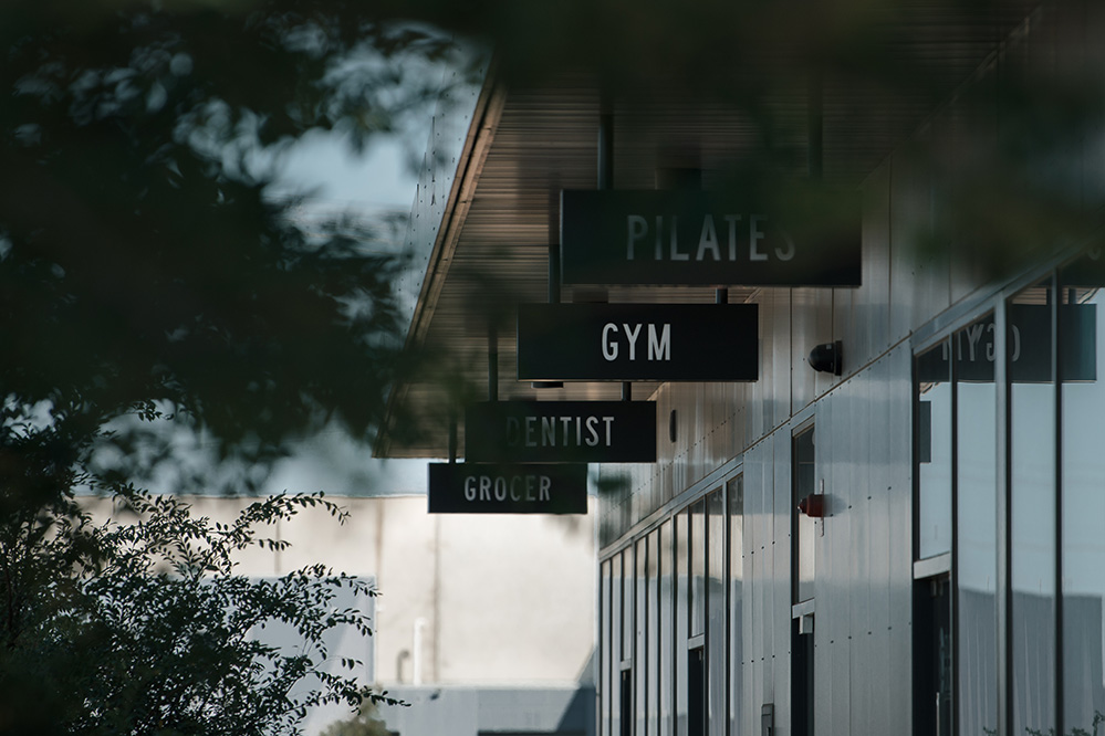
Understanding Mixed-Use Developments
As our population grows and cities become more compact, we are living more densely by necessity and choice. Responding to the need for people to live where they shop and eat where they work, mixed-use urban developments are on the rise, becoming increasingly popular in urban planning and real estate development. As wayfinding signage consultants and designers, we continually adapt our strategies to simplify the navigation of these complex environments.
Mixed-use projects can range from a single building to extensive urban districts with multiple structures, each housing a variety of compatible uses within walkable distances. Essentially, mixed-use developments combine residential, retail, commercial, and other asset classes in one area. They embody the “live-work-play” model or the concept of complete neighbourhoods.
Challenges Faced by Users in Mixed-Use Developments
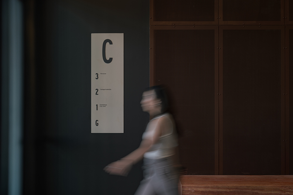
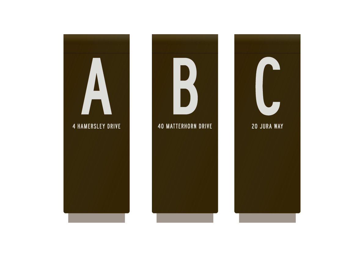
Navigating large-scale mixed-use sites with multiple functions can be daunting. Visitors often encounter various entrances, complex routes, and potentially inconsistent levels. These factors challenge both occupants and visitors as they try to orient themselves and reach their destinations efficiently.
It is particularly challenging to achieve intuitive designs throughout the site for the diverse user groups that all engage with the space, including residents, businesses and visitors from different cultural backgrounds, individuals with disabilities, parents with strollers, elderly individuals, and so on.
Therefore, it is essential for signage specialists to consider all aspects during the research and analysis phases. By adopting a user-centric approach, we can develop effective wayfinding strategies that simplify navigation for all users.
Critical Considerations for Effective Wayfinding Signage Systems
a. Correct Information in the Right Place
Placing the right information in the right locations is essential for an effective wayfinding strategy. In large-scale mixed-use sites, the audience includes apartment residents, businesses, customers, visitors, and patrons. By conducting a thorough audit of the site and understanding user journeys, we can determine what information to display to whom and where.
In addition to the main entrances, it's crucial to identify key “decision-making” points, intersections, and entries that could cause confusion. Strategic placement of information at these locations ensures maximum visibility and clarity, reducing confusion and frustration.
b. Clear and Consistent Signage Design
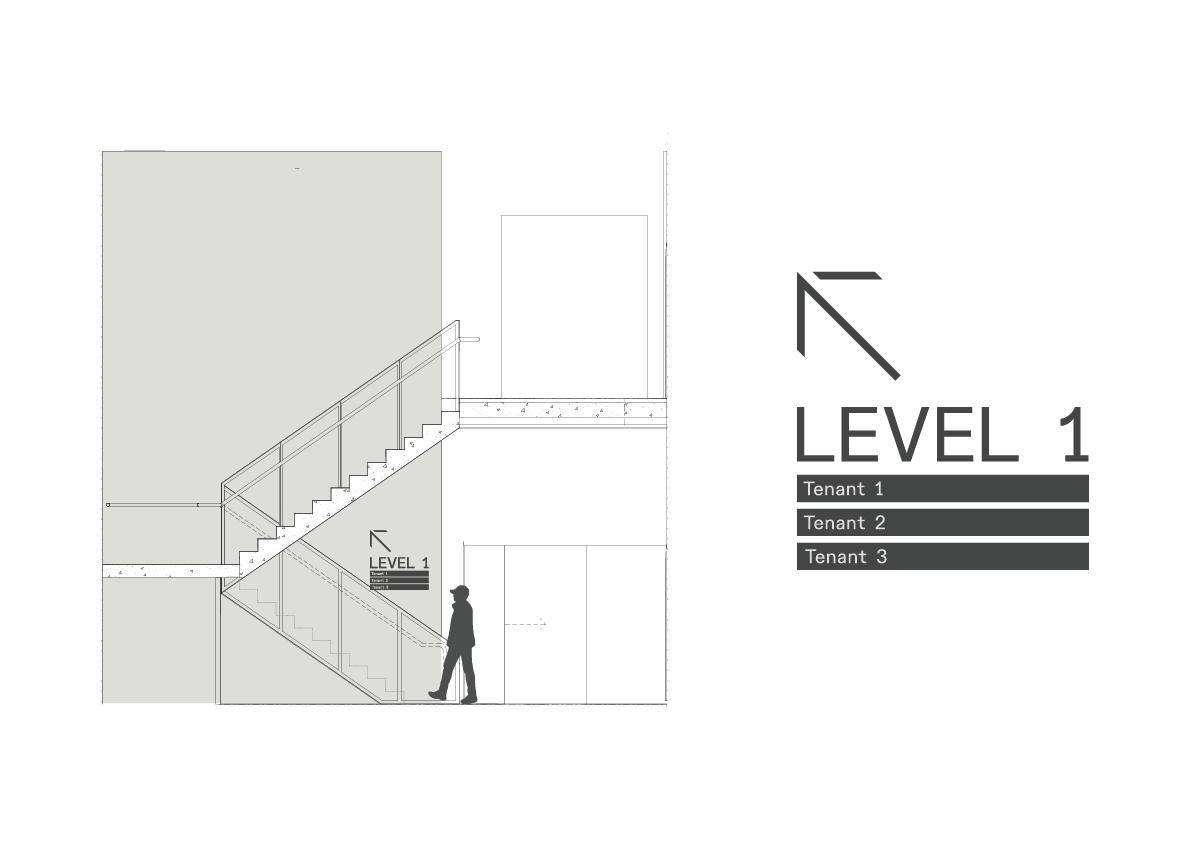
All signage—whether wayfinding, statutory, or regulatory—should be clear, concise, and consistent in design and messaging. This clarity ensures that visual communication through the signs is easily distinguishable and understandable.
Signage consultants collaborate closely with clients, project architects, and interior designers to achieve optimal visual outcomes. Materials and colours are selected for visibility while complementing the overall design. Universally recognised symbols, legible fonts, and straightforward messaging are essential for clear information dissemination.
c. Accessibility and Compliance
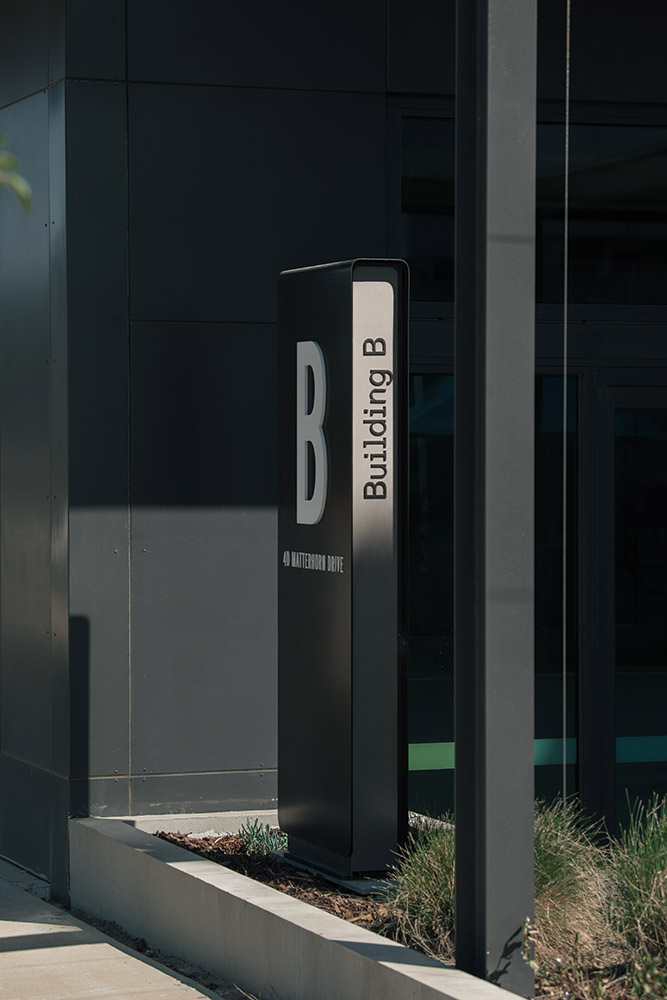
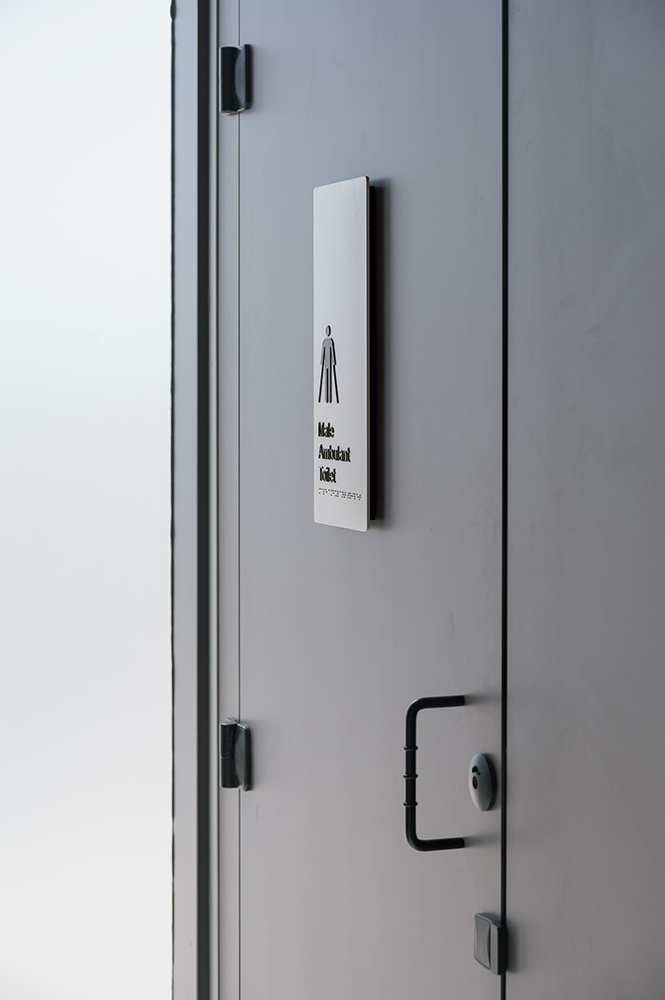
When addressing accessibility and compliance in signage design, we focus on details such as colour contrasts, font size, braille or tactile elements, and the placement and height of signs. In Australia, compliance with standards and regulations like the Disability Discrimination Act 1992 (DDA), AS 1428.1-2009 Design for Access and Mobility, and the Building Code of Australia (BCA) is critical. Note that adherence should be to the most current versions of these laws and guidelines.
Ensuring compliance is not just a regulatory obligation; it's a cornerstone of creating an inclusive environment where everyone can access the services and facilities available.
d. Sustainability in Signage Design
Sustainability and social responsibility are crucial in signage design across all project scales. Choosing eco-friendly and sustainable signage solutions helps reduce our environmental impact.
Conducting thorough site assessments early in the project helps identify environmental factors and potential impacts. This information then guides decisions about where to place signage, the choice of materials, and energy management. Sustainable practices include minimising the number of signs, designing for durability to reduce frequent updates, and selecting non-toxic, locally sourced materials to minimise transportation emissions and waste.
e. Signage as a Brand Touchpoint
Signage often serves as the first and most frequent real-world touchpoint between a brand and its audience. In mixed-use sites, the quantity and quality of signs significantly influence visitors' perceptions.
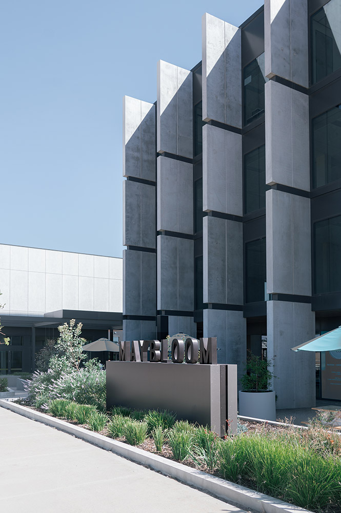
Whether through wayfinding, regulatory signage, or branded environmental graphics, each sign is an opportunity to reinforce your brand. Integrating elements like brand colours, logos, slogans, or value statements helps create a cohesive and holistic brand experience.
Aligning these signage experiences with your brand values fosters emotional connections with visitors, enhancing their sense of belonging and affinity.
f. Incorporating Technology in Signage
Digital signage has revolutionised wayfinding and branding in complex environments like mixed-use developments. Technologies such as LED screens, interactive touchscreens, QR codes, projection-based signage, and mobile apps enhance user navigation in intricate spaces.
While traditional physical signage remains valuable for its durability, cost-effectiveness and aesthetic values, digital signage offers significant benefits. These include ease of updates, interactive maps, and the ability to display real-time information such as events and promotions.
Effective signage design is crucial in mixed-use developments, where complex environments and diverse user needs present unique challenges. This guide has explored the essential aspects of signage design, from understanding mixed-use developments and addressing user challenges to ensuring clear and consistent design, accessibility, and sustainability. We also discussed the integration of technology to enhance wayfinding and branding.
By thoughtfully applying these principles, we can create signage solutions that not only guide and inform but also contribute to a cohesive and engaging user experience.
FAQs
Q: How do you determine the best locations for signage within a mixed-use development?
A: Determining the best locations for signage involves a comprehensive site analysis to identify high-traffic areas, key decision points, and potential bottlenecks. This process includes analysing pedestrian and vehicular flow, understanding user behaviour, and consulting with stakeholders. The goal is to place signs where they will be most visible and useful, guiding users efficiently through the space.
Q: How does signage design differ between mixed-use developments and commercial buildings?
A: Signage design for mixed-use developments is more complex than that of commercial buildings due to the variety of spaces and users involved. In mixed-use developments, signage must guide diverse groups—residents, customers, and visitors—through interconnected areas, often requiring layered and versatile wayfinding solutions. In contrast, commercial buildings typically focus on a single function, such as retail or office use, making signage more straightforward with an emphasis on clear navigation and branding specific to the building's primary purpose.
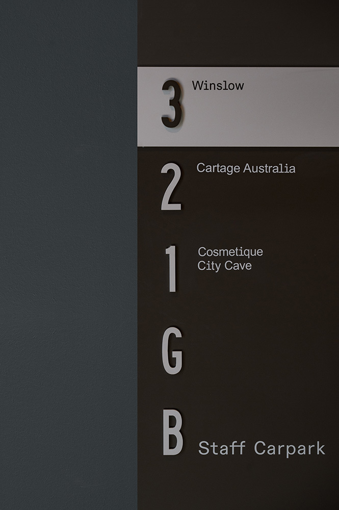
Q: How can the site's branding be incorporated into the signage design while allowing individual businesses to maintain their own branded signs?
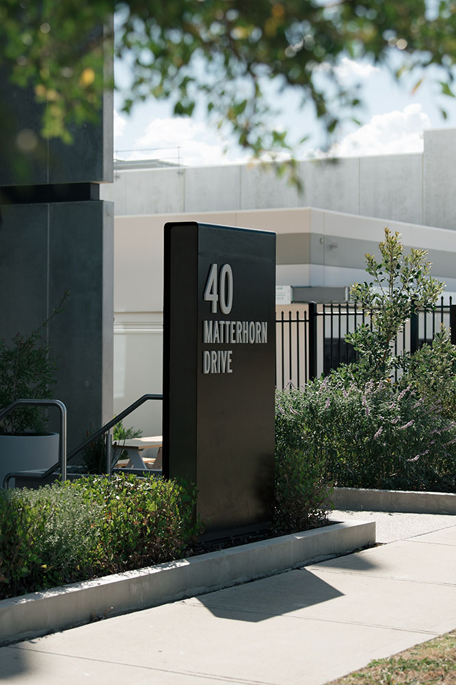
A: It's essential to strike a balance between cohesion and flexibility. The site's overarching branding can be reflected in elements such as colour schemes, typography, and materials used in common areas or directional signs. At the same time, individual businesses should be given designated spaces and guidelines that allow them to display their unique branding within those parameters, ensuring both consistency and distinctiveness across the site.
Q: What are the trends in signage design for mixed-use developments?
A: In 2024, trends in signage design for mixed-use developments focus on technology integration, sustainability, and minimalistic, experience-centric design. Digital signage, such as interactive displays and wayfinding apps, is becoming increasingly popular for its adaptability and enhanced user engagement. Sustainability remains a key consideration, with designers favouring eco-friendly materials and energy-efficient solutions. Another rising trend is minimalistic design, emphasising user-focused experiences with clean lines, modest typography, simple colour palettes, and ample negative space to convey messages effectively and effortlessly.
Project featured in this post is Maybloom Clyde North by H.CO Property.


